L
o
u
R
o
b
i
n
s
o
n
D
e
s
i
g
n
e
r
a
n
d
v
i
s
u
a
l
j
o
u
r
n
a
l
i
s
t
About
China’s growing influence in the Pacific is 5,000 meters deep
Visualizing the US-Israeli war with Iran and retaliation in maps and charts
CNN investigates the fate of Gaza’s missing aid seekers
Satellite images, maps and records reveal huge surge in China’s missile production sites
How Israeli actions caused famine in Gaza, visualized
Gaza’s biggest city is in chaos ahead of an imminent Israeli assault
Each summer, a manmade ‘volcano’ chokes nearby neighborhoods
Everything you need to know about Iran’s nuclear program
Israel has pushed the US to use its bunker buster bomb on Iran
What we know about the Ukrainian drone attack on Russia
Israel's plan to conquer Gaza is leaving people with little place to go
A visual guide to the secretive process of choosing a new pope
All the twists and turns in the US-China trade war
We analyzed nearly 600 Hallmark cards. Here's what we learned
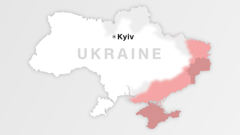
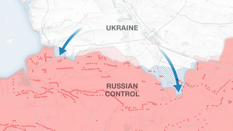
Visualizing how Ukraine has changed in the 3 years since Russia's invasion
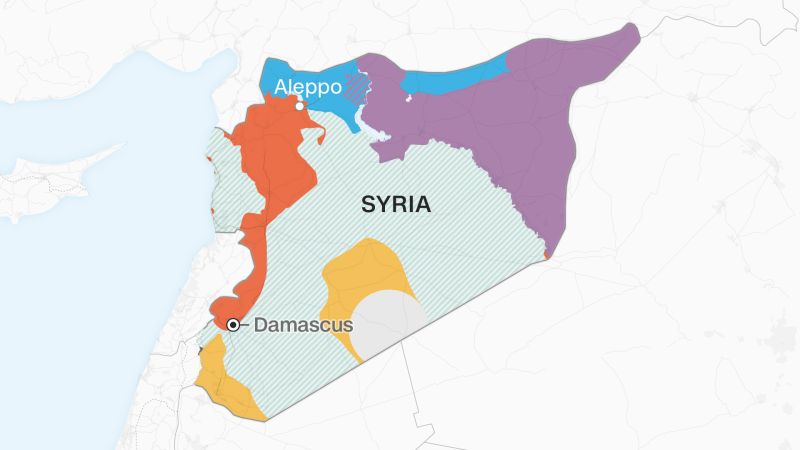
How Syria's rebels toppled the Assad regime, in 7 maps
Hezbollah: A visual guide
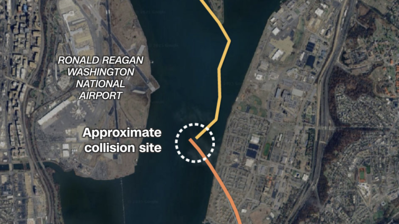
The collision between a passenger plane and a Black Hawk helicopter
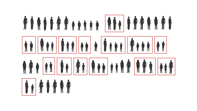
How indiscriminate Israeli fire killed half a family in Gaza
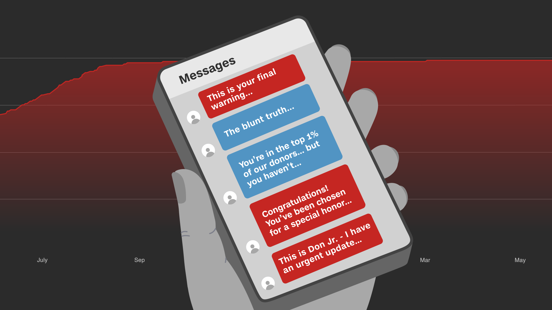
How elderly dementia patients unwittingly fuel political campaigns
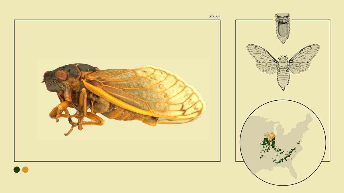
Cicadas Rising: A visual guide to 2024's rare dual appearance
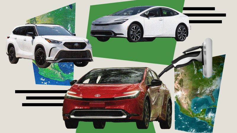
Toyota is hitting the gas on hybrids as EV sales cool.
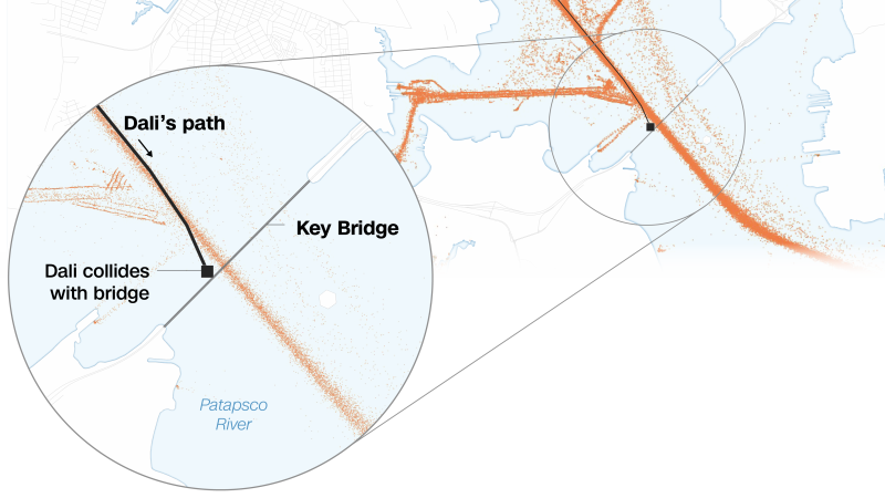
Visualizing the Baltimore Key Bridge collapse
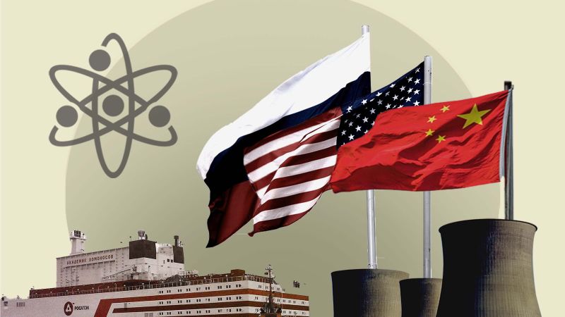
New-wave reactor technology could kick-start a nuclear renaissance
How Gaza's hospitals became battlegrounds
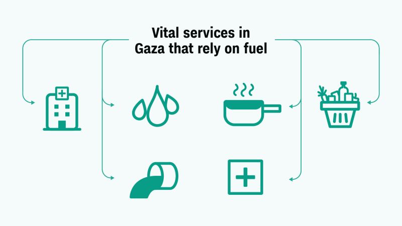
Fuel is a vital lifeline in resource-strapped Gaza. Here's why
Visualizing the Israel-Hamas war
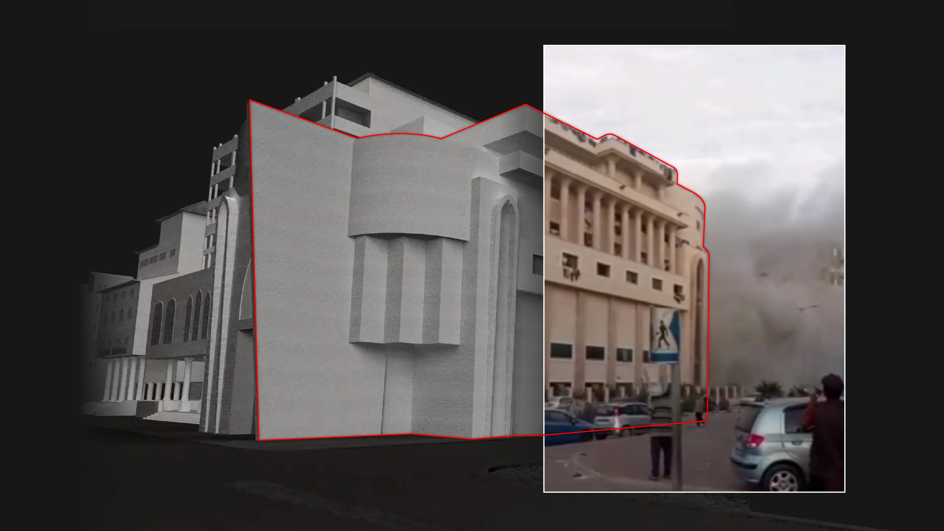
Analysis of images and videos suggests rocket caused Gaza hospital blast
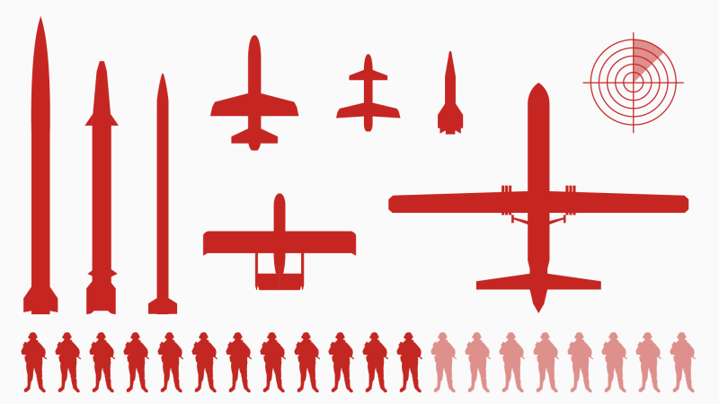
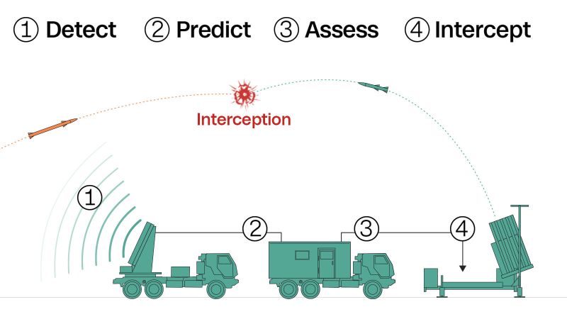
The Iron Dome, explained and visualized
Ukraine aid: Where the money is coming from, in 4 charts
Seeking a breakthrough: A visual guide to Ukraine's counteroffensive
Britain's shadowy border